NREL Geospatial Research Scientist Interview
National Renewable Energy Laboratory
Marie Rivers
October 13, 2022
Overview
Professional background
Wind variability technical task
Improving usability of snow data through open-source tools
Geospatial analysis of power outages
Professional Background
Environmental Engineering Consultant
- Modeled drinking water distribution systems
- Identified diurnal patterns in water use
- Forecasted water demands and compared to future supply projections
- Used diurnal and seasonal patters for extended period simulation models
- Applied spatial analysis to infrastructure siting projects
Environmental Data Science
Obtained a Master of Environmental Data Science degree from UC Santa Barbara June 2022
Besides going to the beach and paddle boarding with my dog, I expanded my technical skills with
- geospatial analysis
- statistics
- remote sensing
- scientific programming with Python and R
- modeling environmental systems
- data visualization
…and fell in love with the concept of reproducible open science
Wind Resource Temporal Variability
Data Workflow
- Explored diurnal and monthly variability of wind resources at Mount Washington in NH
- Used the NREL Wind Integration National Dataset (WIND) Toolkit
- Accessed data with the h5pyd Python package and NREL Highly Scalable Data Service (HSDS)
- Subset the for the
windspeed_100m,dataset and year 2012 - Converted to pandas dataframe
- Aggregated data by hourly and monthly groupings to calculate mean, standard deviation, and quartiles
Visualization of full time series
fig = go.Figure([
    go.Scatter(x = windspeed_100m_df.index, y = windspeed_100m_df['windspeed_100m'],
              mode = 'lines', legendrank = 1,
              name = 'hourly', line=dict(color='blue', width=0.75)),
    go.Scatter(x = moving_averages_24hr.index, y = moving_averages_24hr['windspeed_100m'],
              mode = 'lines', legendrank = 1,
              name = '24 hour avg', line=dict(color='green', width=1), visible='legendonly'),
    go.Scatter(x = moving_averages_10day.index, y = moving_averages_10day['windspeed_100m'],
              mode = 'lines', legendrank = 1,
              name = '10 day avg', line=dict(color='red', width=1), visible='legendonly'),
    go.Scatter(x = moving_averages_30day.index, y = moving_averages_30day['windspeed_100m'],
              mode = 'lines', legendrank = 1,
              name = '30 day avg', line=dict(color='yellow', width=3), visible='legendonly')
])

fig.update_layout(
    margin=dict(l=20, r=20, t=30, b=20),
    paper_bgcolor="#FFFFFF",
    plot_bgcolor='#f5f5f5',
    yaxis=dict(
        title_text="windspeed (m/s)",
        titlefont=dict(size=16)),
    title={
        'text': "Hourly Wind Speed",
        'y':0.99,
        'x':0.5,
        'xanchor': 'center',
        'yanchor': 'top'}
)
Diurnal and Monthly Variability
- Both wind speed and electricity demands fluctuate throughout the day and seasonally
- Wind and electricity patterns may not match
- Unlike water resources, electricity can be challenging to store during low demands
- When selecting sites for utility scale wind power it is important to have adequate wind speeds at the same time as peak electricity demands
- Statistics such as the interquartile range and standard deviation can help quantify the spread of data
Diurnal and Monthly Variability
Hourly average
fig = go.Figure([
    go.Scatter(name = 'mean', y = hourly_avg['mean'], x = hourly_avg['hour'], mode = 'lines',
              line = dict(color = "blue", width = 4),
              error_y = dict(type = 'data', array = hourly_avg['std'], visible = True)),
    go.Scatter(
        name = 'IQR 75', y = hourly_avg['quantile75'], x = hourly_avg['hour'],
        mode='lines',
        marker=dict(color="#444"),
        line=dict(width=0),
        #legendgroup = 'IQR',
        showlegend = False
    ),
    # Create IQR 25 fill color
    go.Scatter(
        name='IQR', y = hourly_avg['quantile25'], x = hourly_avg['hour'],
        marker=dict(color="#444"),
        line=dict(width=0),
        mode='lines',
        fillcolor='rgba(68, 68, 68, 0.3)',
        fill='tonexty', # fill to next y
        legendgroup = 'IQR',
        showlegend = True
    )
])
fig.update_layout(
    xaxis=dict(
        title_text="hour (UTC)",
        titlefont=dict(size=16),
        dtick = 2),
    yaxis=dict(
        title_text="windspeed (m/s)",
        titlefont=dict(size=16)),
    title={
        'text': "Average Hourly Wind Speed for the Year 2012",
        'y':0.99,
        'x':0.5,
        'xanchor': 'center',
        'yanchor': 'top'},
    margin=dict(l=20, r=20, t=30, b=20),
    paper_bgcolor="#FFFFFF",
    plot_bgcolor='#f5f5f5'
)
Monthly average
fig = go.Figure([
    go.Scatter(name = 'mean', y = monthly_avg['mean'], x = monthly_avg['month'],
              mode = 'lines', line = dict(color = "blue", width = 4),
              error_y = dict(type = 'data', array = monthly_avg['std'], visible = True)),
    go.Scatter(
        name = 'IQR 75', y = monthly_avg['quantile75'], x = monthly_avg['month'],
        mode='lines', marker=dict(color="#444"), line=dict(width=0),
        showlegend = False
    ),

    # Create IQR 25 fill color
    go.Scatter(
        name='IQR', y = monthly_avg['quantile25'], x = monthly_avg['month'],
        marker=dict(color="#444"), line=dict(width=0), mode='lines',
        fillcolor='rgba(68, 68, 68, 0.3)',
        fill='tonexty', # fill to next y
        legendgroup = 'IQR',
        showlegend = True)
])
fig.update_layout(
    xaxis=dict(
        title_text="month",
        titlefont=dict(size=16),
        dtick = 1),
    yaxis=dict(
        title_text="windspeed (m/s)",
        titlefont=dict(size=16)),
    title={
        'text': "Average Monthly Wind Speed for the Year 2012",
        'y':0.99,
        'x':0.5,
        'xanchor': 'center',
        'yanchor': 'top'},
    margin=dict(l=20, r=20, t=30, b=20),
    paper_bgcolor="#FFFFFF",
    plot_bgcolor='#f5f5f5'
)
Diurnal and Monthly Variability
fig = go.Figure([
    go.Scatter(y = hourly_avg_by_month['1'], x = hourly_avg_by_month.index,
              mode = 'lines', legendrank = 1,
              name = 'January', line=dict(color='#DC050C', width=2)),
    go.Scatter(y = hourly_avg_by_month['2'], x = hourly_avg_by_month.index,
              mode = 'lines+markers', legendrank = 2,
              name = 'February', line=dict(color='#E8601c', width=2)),
    go.Scatter(y = hourly_avg_by_month['3'], x = hourly_avg_by_month.index,
              mode = 'lines', legendrank = 3,
              name = 'March', line=dict(color='#f4a736', width=2)),
    go.Scatter(y = hourly_avg_by_month['4'], x = hourly_avg_by_month.index,
              mode = 'lines+markers', legendrank = 4,
              name = 'April', line=dict(color='#f7f056', width=2)),
    go.Scatter(y = hourly_avg_by_month['5'], x = hourly_avg_by_month.index,
              mode = 'lines', legendrank = 5,
              name = 'May', line=dict(color='#cae0ab', width=2)),
    go.Scatter(y = hourly_avg_by_month['6'], x = hourly_avg_by_month.index,
              mode = 'lines+markers', legendrank = 6,
              name = 'June', line=dict(color='#4eb265', width=2)),
    go.Scatter(y = hourly_avg_by_month['7'], x = hourly_avg_by_month.index,
              mode = 'lines', legendrank = 7,
              name = 'July', line=dict(color='#7bafde', width=2)),
    go.Scatter(y = hourly_avg_by_month['8'], x = hourly_avg_by_month.index,
              mode = 'lines+markers', legendrank = 8,
              name = 'August', line=dict(color='#5289c7', width=2)),
    go.Scatter(y = hourly_avg_by_month['9'], x = hourly_avg_by_month.index,
              mode = 'lines', legendrank = 9,
              name = 'September', line=dict(color='#1965b0', width=2)),
    go.Scatter(y = hourly_avg_by_month['10'], x = hourly_avg_by_month.index,
              mode = 'lines+markers', legendrank = 10,
              name = 'October', line=dict(color='#882e72', width=2)),
    go.Scatter(y = hourly_avg_by_month['11'], x = hourly_avg_by_month.index,
              mode = 'lines', legendrank = 11,
              name = 'November', line=dict(color='#ae76a3', width=2)),
    go.Scatter(y = hourly_avg_by_month['12'], x = hourly_avg_by_month.index,
              mode = 'lines+markers', legendrank = 12,
              name = 'December', line=dict(color='#d1bbd7', width=2)),
    go.Scatter(name = 'annual mean', y = hourly_avg['mean'], x = hourly_avg['hour'], mode = 'lines',
              line = dict(color = "black", width = 5))

])

variables_to_hide = ['February', 'March', 'April', 'May', 'June', 'July',
                    'August', 'September', 'October', 'November', 'December']
fig.for_each_trace(lambda trace: trace.update(visible="legendonly")
                   if trace.name in variables_to_hide else ())

fig.update_layout(
    xaxis=dict(
        title_text="hour (UTC)",
        titlefont=dict(size=16),
        dtick = 4),
    yaxis=dict(
        title_text="windspeed (m/s)",
        titlefont=dict(size=16)),
    title={
        'text': "Average Hourly Wind Speed by Month",
        'y':0.99,
        'x':0.5,
        'xanchor': 'center',
        'yanchor': 'top'},
    margin=dict(l=20, r=20, t=30, b=20),
    paper_bgcolor="#FFFFFF",
    plot_bgcolor='#f5f5f5'
)
Diurnal and Monthly Variability
heatmap_month = hourly_avg_by_month.columns.tolist()
heatmap_hour = hourly_avg_by_month.index.tolist()
heatmap_windspeed = hourly_avg_by_month.values.tolist()

trace = go.Heatmap(
   x = heatmap_month,
   y = heatmap_hour,
   z = heatmap_windspeed,
   type = 'heatmap',
   #colorscale = [(0,"blue"), (1,"red")],
   colorscale = 'mint',
   colorbar=dict(title='Wind Speed (m/s)')
)
data = [trace]
fig = go.Figure(data = data)

fig.update_layout(
    #width=1000,
    height=650,
    xaxis=dict(
        title_text="month",
        titlefont=dict(size=16),
        #dtick = 1,
        tickmode = 'array',
        # Set tick intervals to correspond with months
        tickvals = [1, 2, 3, 4, 5, 6, 7, 8, 9, 10, 11, 12],
        ticktext = ['January', 'February', 'March', 'April',
                    'May', 'June', 'July', 'August',
                    'September', 'October', 'November', 'December'],
        tickfont = dict(size=16)),
    yaxis=dict(
        title_text="hour (UTC)",
        titlefont=dict(size=16),
        dtick = 1,
        tickfont = dict(size=16)),
    title={
        'text': "Average Wind Speed by Month and Hour",
        'y':0.99,
        'x':0.5,
        'xanchor': 'center',
        'yanchor': 'top'},
    margin=dict(l=20, r=20, t=30, b=20),
)
Standard Deviation
std_heatmap_month = hourly_std_by_month.columns.tolist()
std_heatmap_hour = hourly_std_by_month.index.tolist()
std_heatmap_windspeed = hourly_std_by_month.values.tolist()

trace = go.Heatmap(
   x = std_heatmap_month,
   y = std_heatmap_hour,
   z = std_heatmap_windspeed,
   type = 'heatmap',
   colorscale = 'Blues',
   colorbar=dict(title='Standard Deviation (m/s)')
)
data = [trace]
fig = go.Figure(data = data)

fig.update_layout(
    #width=1000,
    height=650,
    xaxis=dict(
        titlefont=dict(size=16),
        #dtick = 1,
        tickmode = 'array',
        # Set tick intervals to correspond with months
        tickvals = [1, 2, 3, 4, 5, 6, 7, 8, 9, 10, 11, 12],
        ticktext = ['January', 'February', 'March', 'April',
                    'May', 'June', 'July', 'August',
                    'September', 'October', 'November', 'December'],
        tickfont = dict(size=16)),
    yaxis=dict(
        title_text="hour (UTC)",
        titlefont=dict(size=16),
        dtick = 1,
        tickfont = dict(size=16)),
    title={
        'text': "Wind Speed Standard Deviation by Month and Hour",
        'y':0.99,
        'x':0.5,
        'xanchor': 'center',
        'yanchor': 'top'},
    margin=dict(l=20, r=20, t=30, b=20),
)
Statistical Summary
| min wind speed (m/s) | max wind speed (m/s) | |
|---|---|---|
| hourly | 0.1 | 36.7 |
| hourly average | 10.7 | 12.5 |
| monthly average | 8.8 | 15.8 |
| smallest variability | greatest variability | smallest average wind speed | greatest average wind speed | |
|---|---|---|---|---|
| monthly | July | November | August | February |
| hourly | 19 | 13 | 16 | 1 |
Conclusions
- Greatest monthly variability in November
- Smallest monthly variability in July
- Highest wind speeds in February
- Lowest wind speeds in August
- Slower wind speeds mid-day than at night
- Based on the seasonal variability, this site would be better at meeting high winter demands than summer demands
- This site may not be ideal for meeting all daytime demands.
Expanded Geographic Scale
Created a parameterized report using Quarto as a tool to allow users to generate summary reports based on specified inputs from CLI or with render function for multiple sites.
Modify by specifying parameters for:
- site name
- site latitude
- site longitude
- start date
- end date
- turbine cut-in speed
- turbine cut-out speed
- required annual average wind speed
Default parameters are:
- start date: ‘2012-01-01’
- end date: ‘2013-01-01’
- cut-in speed: 3.6 m/s
- cut-out speed: 24.6 m/s
- required annual avg speed: 5.8 m/s
Expanded Geographic Scale
In the CLI the example code below renders a report for NYC in 2010 using default values for cut-in speed, cut-out speed, and required annual average wind speed.
quarto render report.qmd -P site_name:“New York City” -P site_lat:40.7128 -P site_lon:-74.0059 -P start_date:2010-01-01 -P end_date:2011-01-01 --output new_york_city_report.pdf (>)
This function generates multiples reports from a dataframe of parameters for different sites.
render_fun <- function(param_df){
  quarto::quarto_render(
    input = "report.qmd",
    execute_params = list(site_name = param_df$site_name,
                          site_lat = param_df$site_lat,
                          site_lon = param_df$site_lon,
                          start_date = param_df$start_date,
                          end_date = param_df$end_date),
    output_file = glue::glue("{param_df$site_name}-report.pdf"))}

param_list <- split(report_parameters, seq(nrow(report_parameters))) %>%
  purrr::walk(render_fun)
Report
For the specified site, the report answers the following questions:
- Is the annual average wind speed at least 13 mph (5.8 m/s)? 1
- How often the wind is below the cut-in speed of 8 mph (3.6 m/s)? 2
- How often the wind exceed the cut-out speed of 55 mph (24.6 m/s)?
Citations
Draxl, C., B.M. Hodge, A. Clifton, and J. McCaa. 2015. Overview and Meteorological Validation of the Wind Integration National Dataset Toolkit (Technical Report, NREL/TP-5000-61740). Golden, CO: National Renewable Energy Laboratory.
Draxl, C., B.M. Hodge, A. Clifton, and J. McCaa. 2015. “The Wind Integration National Dataset (WIND) Toolkit.” Applied Energy 151: 355366.
King, J., A. Clifton, and B.M. Hodge. 2014. Validation of Power Output for the WIND Toolkit (Technical Report, NREL/TP-5D00-61714). Golden, CO: National Renewable Energy Laboratory.
https://www.eia.gov/electricity/gridmonitor/dashboard/electric_overview/US48/US48
Snow Today
Improving usability of snow data through web based visualizations and tutorials
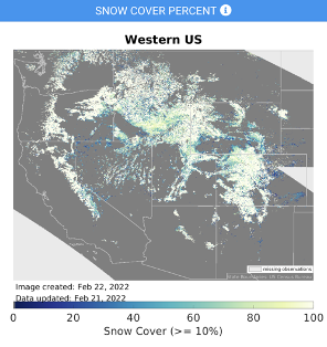
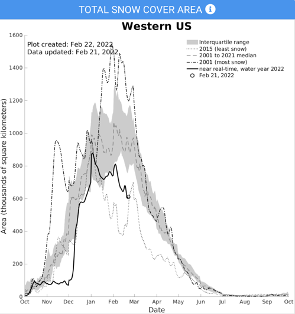
Knowing the spatial extent of snow cover is critical for water management and winter recreation. Climate change will affect the variability of frozen water resources.
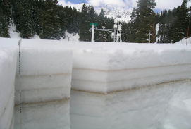
Snow Science: UCSB CUES Field Station Site Visit
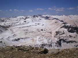
Albedo Importance
- Regulates the Earth’s temperature by reflecting solar radiation
- Influences rate of snow melt
- Particularly important in the Western US
- Accurate estimates critical for climate models and predicting water storage
Snow Today
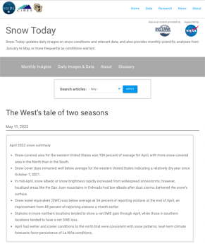
- Scientific analysis website that provides data on snow conditions from satellite and surface measurements
- Used by scientists, water managers, and outdoor enthusiasts for snow observations
- Spatial products offered include measures of snow cover extent and albedo
Snow Today: Usability
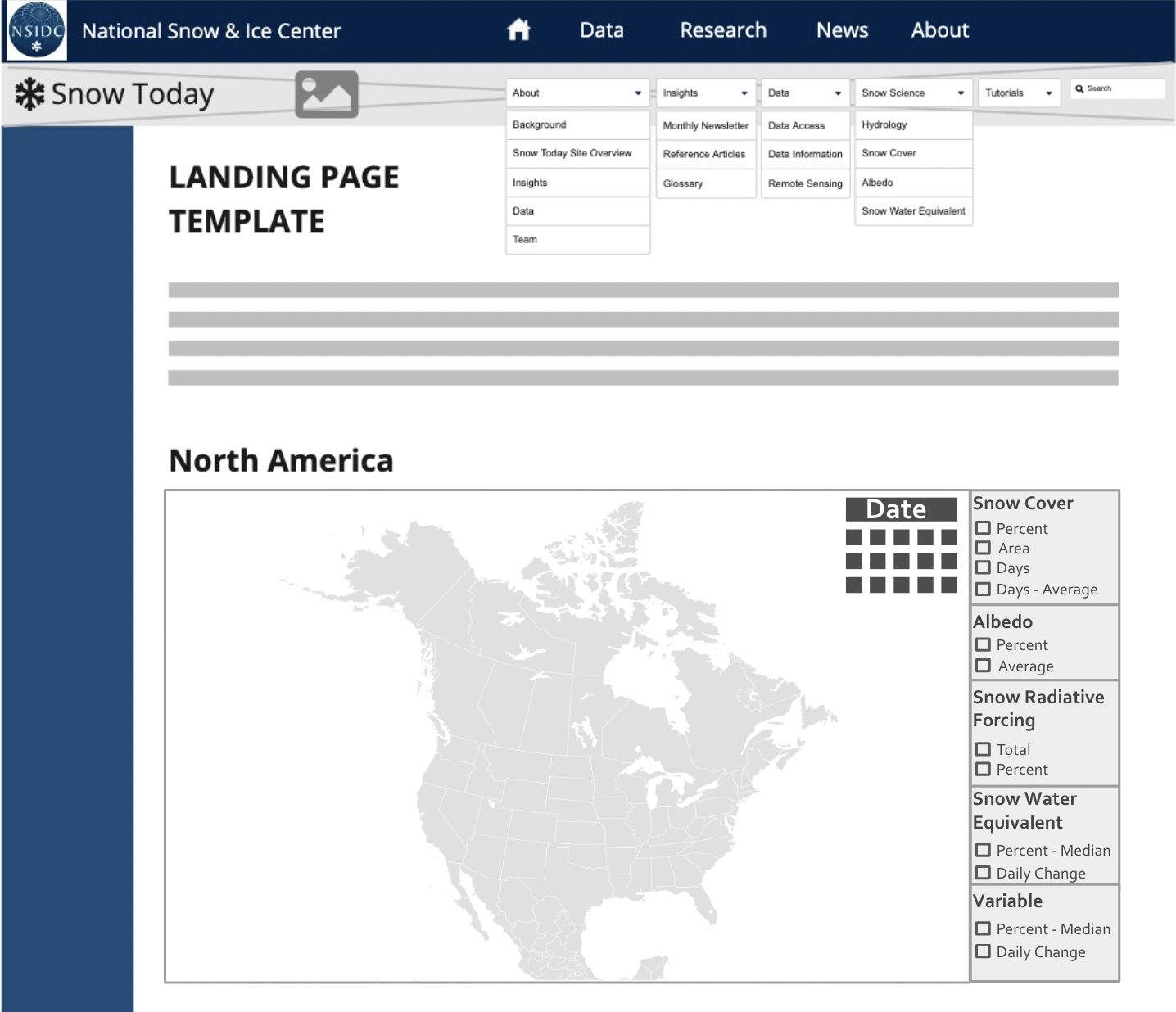
Snow Today can be hard to navigate for new users unfamiliar with the website’s layout
Visualizations are of current snow conditions, and have limited customization options
Snow cover and albedo files are hard to find
Data format may be challenging for new users
Snow metadata is stored in a non-standardized format which is difficult for some software to interpret the data
Users may have trouble processing and analyzing snow data without the help
Snow Today: Visualizations
Objectives
Create an open source workflow for processing and visualizing snow data
- Provide recommendations for the Snow Today website
- Create interactive visualizations
- Improve data usability through tutorials in Python
Website Recommendations
website architecture

Website Recommendations
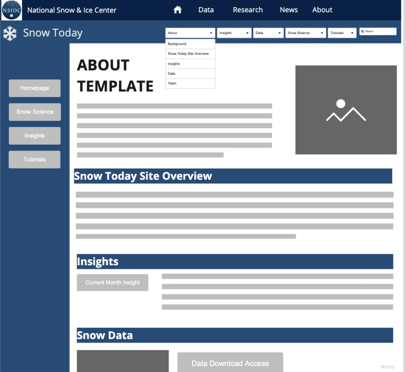
Objectives

Create an open source workflow for processing and visualizing snow data
- Provide recommendations for the Snow Today website
2. Create interactive visualizations
- Improve data usability through tutorials in Python
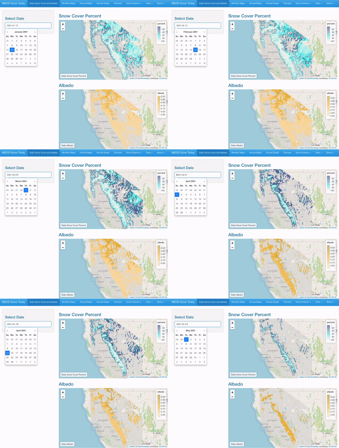
Interactive Visualizations
Prototype Web Application
Daily maps of snow cover and albedo for any selected date
Interactive Visualizations
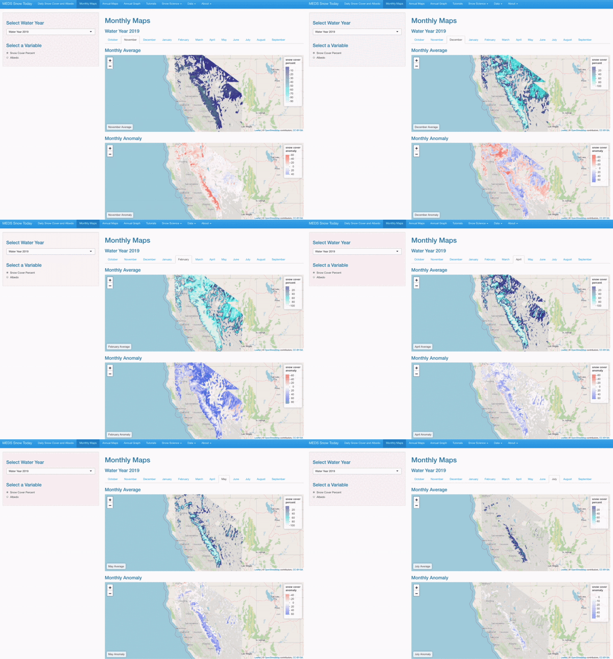
Monthly Average and Anomaly
Users can select a specific month, water year, and variable to view averages on anomalies.
Interactive Visualizations
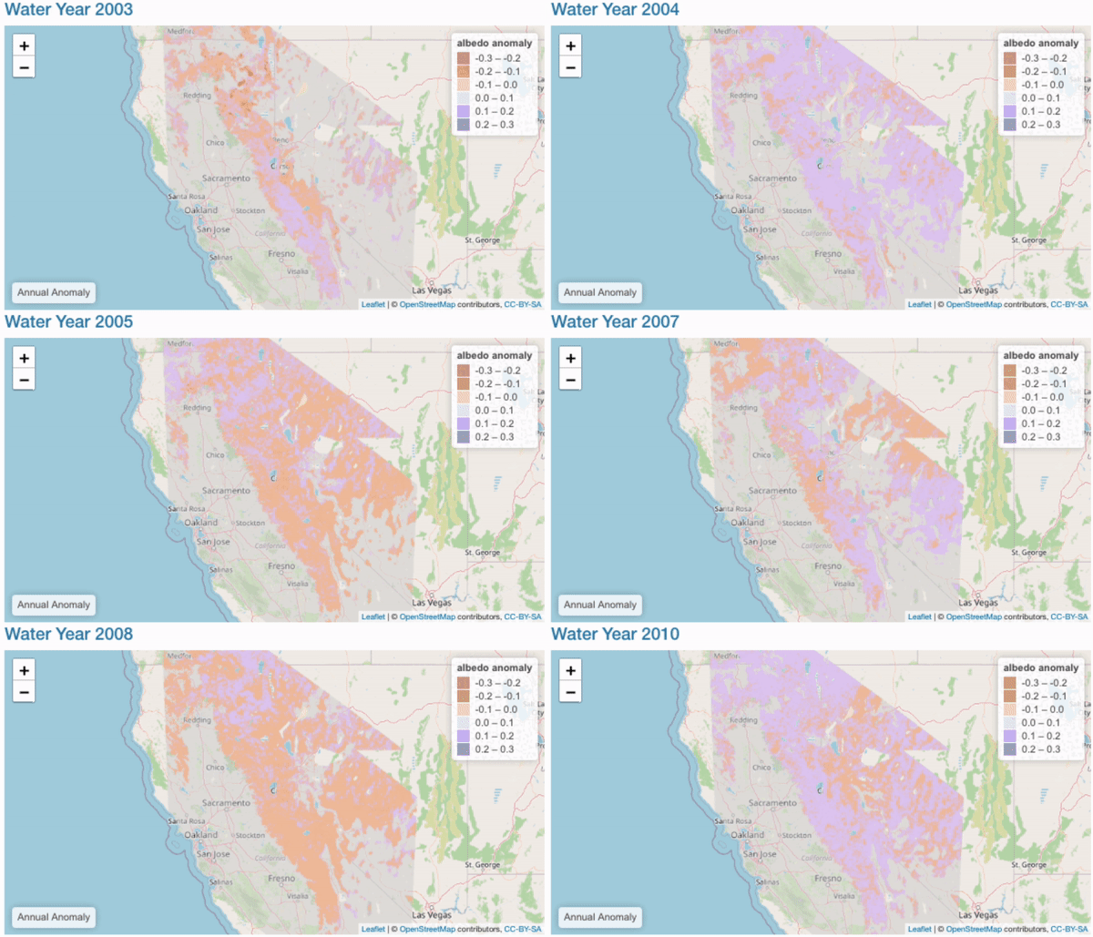
Annual Comparisons
Interactive Visualizations
snow_cover_df = pd.read_csv('data/snow_cover_df.csv')
snow_cover_df = snow_cover_df.fillna(0)

# Create empty list to input with for loop
IQR_25 = []
IQR_75 = []
IQR_50 = []
days = []
for i in range(len(snow_cover_df)):
    #Takes the IQR of each day (25, 50, 75)
    Q1 = np.percentile(snow_cover_df.iloc[i], 25)
    Q2 = np.percentile(snow_cover_df.iloc[i], 50)
    Q3 = np.percentile(snow_cover_df.iloc[i], 75)
    #appends list with IQR outputs
    IQR_25.append(Q1)
    IQR_50.append(Q2)
    IQR_75.append(Q3)
    #Creates day list to append dataset with
    days.append(i + 1)

# Next, need to create a single column of mean values.
snow_cover_df['Average Snow Cover'] = snow_cover_df.mean(axis = 1)

#Appends list for loop lists
snow_cover_df['IQR_25'] = IQR_25
snow_cover_df['IQR_75'] = IQR_75
snow_cover_df['IQR_50'] = IQR_50
snow_cover_df['days'] = days

month_day = [31, 30, 31, 31, 28, 31, 30, 31, 30, 31, 31, 30]
new_list = []

j = 0
for i in range(0,len(month_day)):
    j+=month_day[i]
    new_list.append(j)

# Create a list of years to graph. legend rank allows lets you order where the lines are located on the chart.
for i in range(len(snow_cover_df)):
    print("""go.Scatter("""
        """name = '""" + str(i + 2001) + """', """
        """y = snow_cover_df['"""+ str(i + 2001) + """'], x = snow_cover_df['days'], """
        """mode = 'lines', legendrank = """ + str(19-i) + """),"""
    )
#Plot the figure.
fig = go.Figure([

#create median line
go.Scatter(
    #Name that appears on legend
    name = 'Median',
    # y-dim
    y = snow_cover_df['IQR_50'],
    # x-dim
    x = snow_cover_df['days'],
    # type of plot
    mode = 'lines',
    # Include to select/deselect multiple variables at once
    legendgroup = 'IQR',
    # Name of legend group on legend
    legendgrouptitle_text="<b>Interquartile Range</b>",
    # Legend position
    legendrank = 20,
    # Line color
    line=dict(color='rgb(31, 119, 180)'),
),
#Create IQR 75 line
go.Scatter(
        name = 'IQR 75', y = snow_cover_df['IQR_75'], x = snow_cover_df['days'],
        mode='lines', marker=dict(color="#444"), line=dict(width=0),
        legendgroup = 'IQR', showlegend = False
        # Here we 'hide' the name from appearing on the legend since it's lumped in with the legendgroup 'IQR'
    ),
    #Create IQR 25 fill color
    go.Scatter(
        name='IQR 25', y = snow_cover_df['IQR_25'], x = snow_cover_df['days'],
        marker=dict(color="#444"), line=dict(width=0),  mode='lines',
        fillcolor='rgba(68, 68, 68, 0.3)', fill='tonexty',
        legendgroup = 'IQR', showlegend = False
    ),
    #Create mean line
    go.Scatter(
        name = 'Average Snow Cover',  y = snow_cover_df['Average Snow Cover'], x = snow_cover_df['days'],
        mode = 'lines', legendgroup = 'Average',
        legendgrouptitle_text = '<b>Average</b>', legendrank = 21
    ),
#Create lines for each respective year
go.Scatter(name = '2001', y = snow_cover_df['2001'], x = snow_cover_df['days'], mode = 'lines', legendrank = 19),
go.Scatter(name = '2002', y = snow_cover_df['2002'], x = snow_cover_df['days'], mode = 'lines', legendrank = 18),
go.Scatter(name = '2003', y = snow_cover_df['2003'], x = snow_cover_df['days'], mode = 'lines', legendrank = 17),
go.Scatter(name = '2004', y = snow_cover_df['2004'], x = snow_cover_df['days'], mode = 'lines', legendrank = 16),
go.Scatter(name = '2005', y = snow_cover_df['2005'], x = snow_cover_df['days'], mode = 'lines', legendrank = 15),
go.Scatter(name = '2006', y = snow_cover_df['2006'], x = snow_cover_df['days'], mode = 'lines', legendrank = 14),
go.Scatter(name = '2007', y = snow_cover_df['2007'], x = snow_cover_df['days'], mode = 'lines', legendrank = 13),
go.Scatter(name = '2008', y = snow_cover_df['2008'], x = snow_cover_df['days'], mode = 'lines', legendrank = 12),
go.Scatter(name = '2009', y = snow_cover_df['2009'], x = snow_cover_df['days'], mode = 'lines', legendrank = 11),
go.Scatter(name = '2010', y = snow_cover_df['2010'], x = snow_cover_df['days'], mode = 'lines', legendrank = 10),
go.Scatter(name = '2011', y = snow_cover_df['2011'], x = snow_cover_df['days'], mode = 'lines', legendrank = 9),
go.Scatter(name = '2012', y = snow_cover_df['2012'], x = snow_cover_df['days'], mode = 'lines', legendrank = 8),
go.Scatter(name = '2013', y = snow_cover_df['2013'], x = snow_cover_df['days'], mode = 'lines', legendrank = 7),
go.Scatter(name = '2014', y = snow_cover_df['2014'], x = snow_cover_df['days'], mode = 'lines', legendrank = 6),
go.Scatter(name = '2015', y = snow_cover_df['2015'], x = snow_cover_df['days'], mode = 'lines', legendrank = 5),
go.Scatter(name = '2016', y = snow_cover_df['2016'], x = snow_cover_df['days'], mode = 'lines', legendrank = 4),
go.Scatter(name = '2017', y = snow_cover_df['2017'], x = snow_cover_df['days'], mode = 'lines', legendrank = 3),
go.Scatter(name = '2018', y = snow_cover_df['2018'], x = snow_cover_df['days'], mode = 'lines', legendrank = 2),
go.Scatter(name = '2019', y = snow_cover_df['2019'], x = snow_cover_df['days'], mode = 'lines', legendrank = 1)

])
# Can change default "off" variables. Right now, the only variable visible is year_2019 and IQR
variables_to_hide = ['2001', '2002', '2003', '2004', '2005', '2006', '2007',
'2008', '2009', '2010', '2011', '2012', '2013', '2014', '2015', '2016', '2017', '2018',
'Average Snow Cover']
fig.for_each_trace(lambda trace: trace.update(visible="legendonly")
                   if trace.name in variables_to_hide else ())
fig.update_layout(
    title = "<b> Annual Snow Cover Area: Sierra Nevada Region </b> <br> <sup>2001-2019</sup></br>",
    legend_title="<b>Year</b>",
    autosize=False,
    width=1200,
    height=700,
    template = 'none',
    font=dict(
        size=16),
xaxis = dict(
        tickmode = 'array',
        tickvals = [1, 31, 61, 92, 123, 151, 182, 212, 243, 273, 304, 335, 365],
        ticktext = ['<b>October</b>', '<b>November</b>', '<b>December</b>', '<b>January</b>', '<b>February</b>', '<b>March</b>', '<b>April</b>', '<b>May</b>',
        '<b>June</b>', '<b>July', '<b>August</b>', "<b>September</b>", "<b>October</b>"],
        tickfont = dict(size=12))
)

fig.update_xaxes(title_text = "", gridcolor = 'lightgrey', gridwidth = 0.1)
fig.update_yaxes(title_text = "<b> Area (Thousands of Square Kilometers) </b>",
    title_font = {"size": 15}, gridcolor = 'lightgrey', gridwidth = 0.1)
Objectives

Create an open source workflow for processing and visualizing snow data
Provide recommendations for the Snow Today website
Create interactive visualizations
3. Improve data usability through tutorials in Python
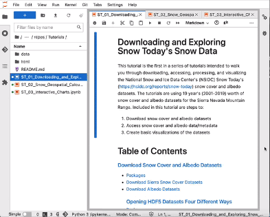
Tutorials
1. Download and Explore Datasets
2. Process and Format Data
3. Analyze and Visualize Snow Data
Tutorials
1. Download and Explore Datasets
2. Process and Format Data
3. Analyze and Visualize Snow Data
- Download snow cover and albedo datasets
- Open datasets and view metadata
- Create basic visualizations of each dataset
Tutorials
1. Download and Explore Datasets
2. Process and Format Data
3. Analyze and Visualize Snow Data
- Process and subset datasets
- Calculate monthly and yearly snow cover and albedo averages and anomalies
- Create interactive maps of processed data
- Convert processed data to GeoTiff and NetCDF formats
Tutorials
1. Download and Explore Datasets
2. Process and Format Data
3. Analyze and Visualize Snow Data
- Calculate total snow cover area and average albedo for entire spatial domain
- Perform basic statistical analysis of datasets
- Develop interactive charts to compare snow cover area and albedo percentages for each water year
Contributions

As water resources become harder to manage due to climate change, implementing these tools will open a valuable dataset to a wider audience
Acknowledgements
Faculty Advisors
Sam Stevenson, UCSB Bren School
Allison Horst, UCSB Bren School
Clients
Timbo Stillinger, UCSB Earth Research Institute
Ned Bair, UCSB Earth Research Institute
Karl Rittger, CU Boulder Institute of Arctic & Alpine Research
External Advisors
James Frew, UCSB Bren School
Niklas Griessbaum, UCSB Bren School
Kat Le, UCSB Bren School
Michael Colee, UCSB Geography & Earth Research Institute
Bren School Faculty and Staff and the MEDS 2022 cohort
Houston Power Outages
A Geospatial and Statistical Analysis
Background
In February 2021 the Houston, TX metropolitan area experienced wide scale power outages due to electrical infrastructure failure during winter storms and extreme cold temperatures
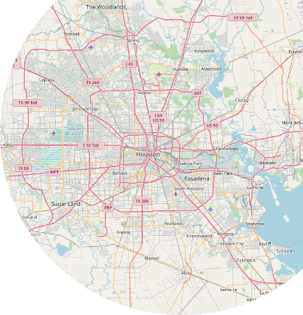
1.4 million customers without power
Approach
Use geospatial and statistical methods to quantify:
Number of residential homes without power
Socioeconomic differences of areas with and without power
…by using data from:
Satellite imagery of nighttime lights
OpenStreetMaps roadways and buidings
Census tract level race, age and income variables
Project overview
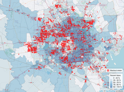
- Load satellite imagery
- Create blackout mask
- Identify residential buildings within blackout area
- Spatially join census data to blackout areas
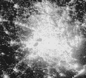
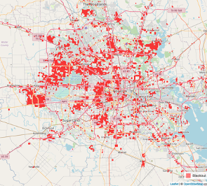
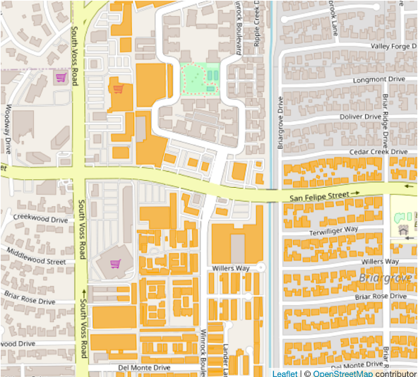
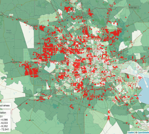
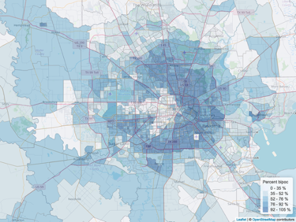
+144,000 households without power
Percent white
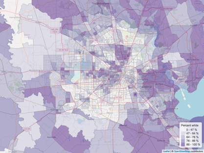
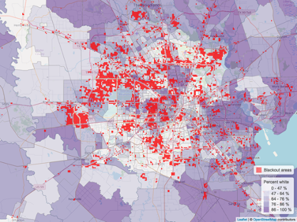
Percent bipoc
Statistical Analysis
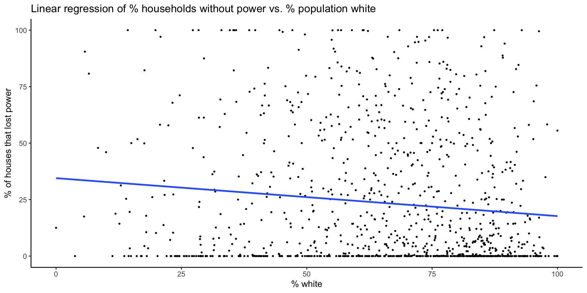
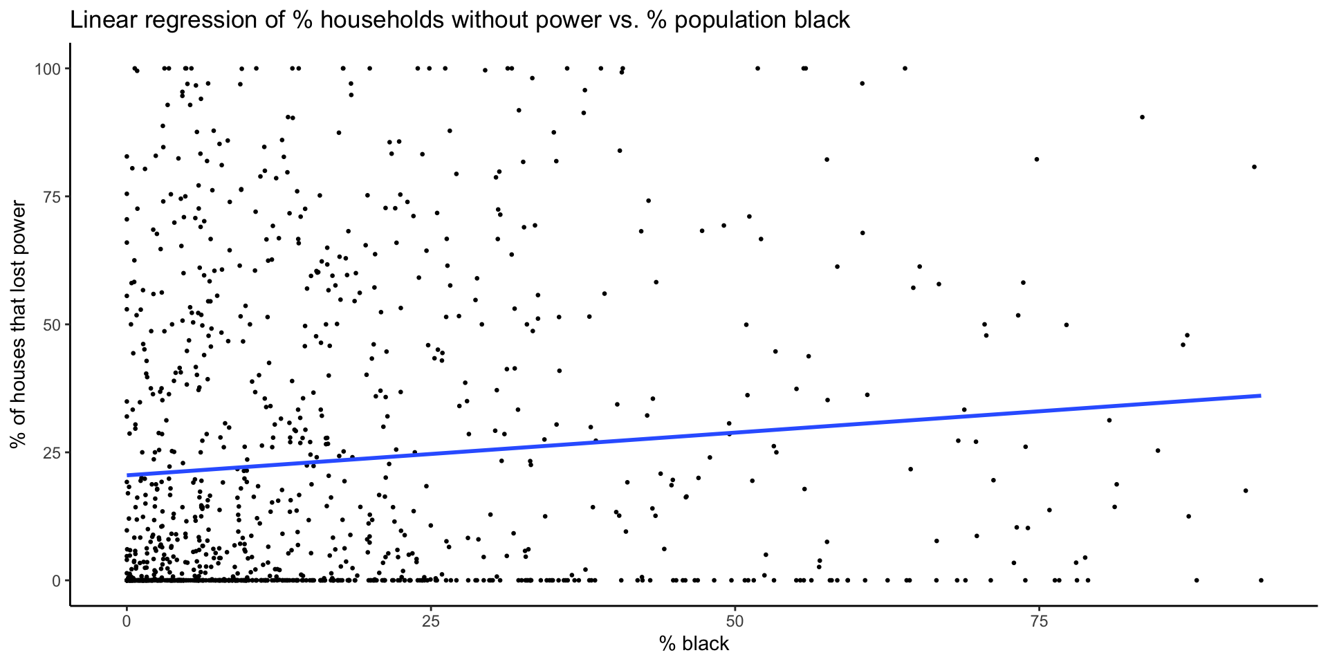
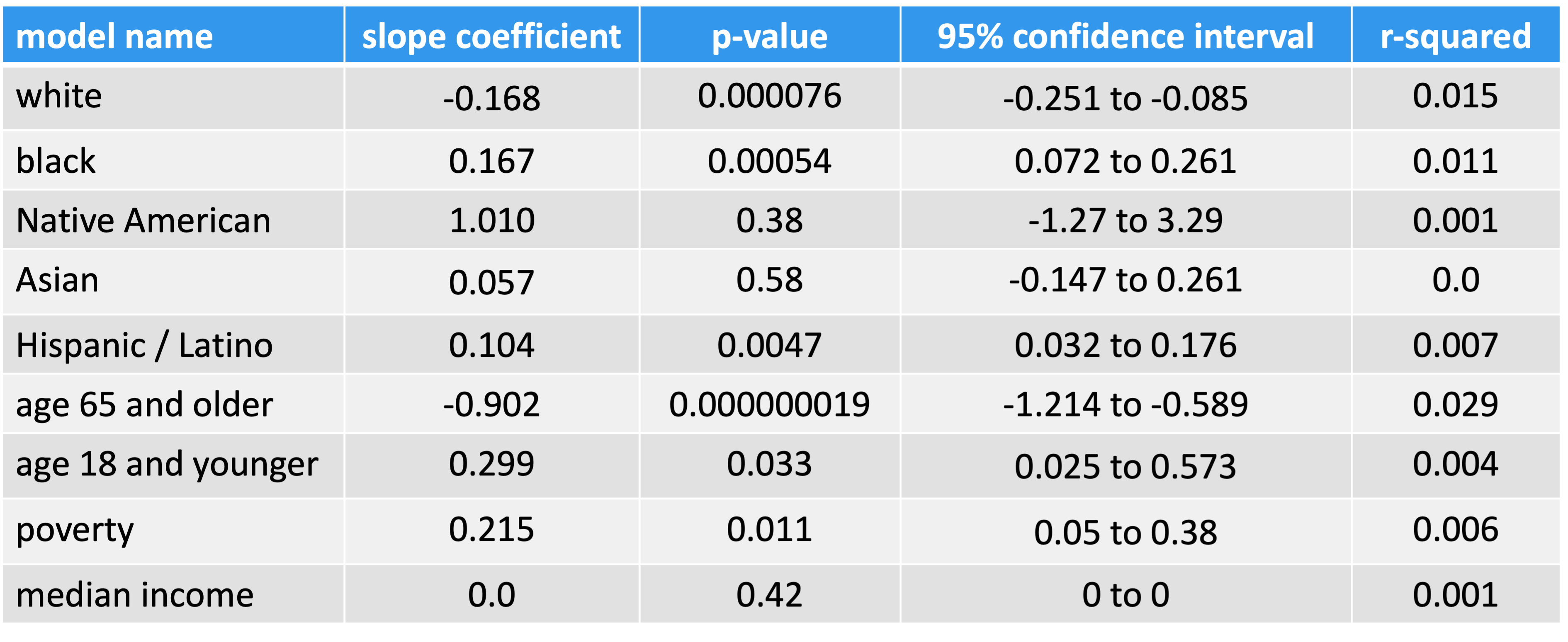
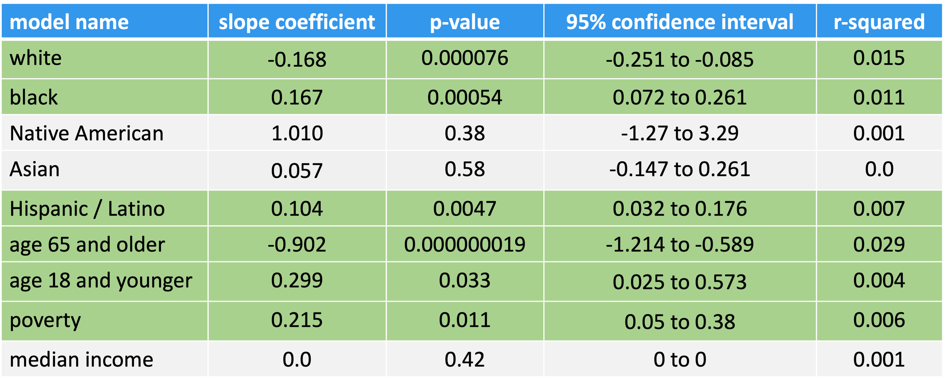
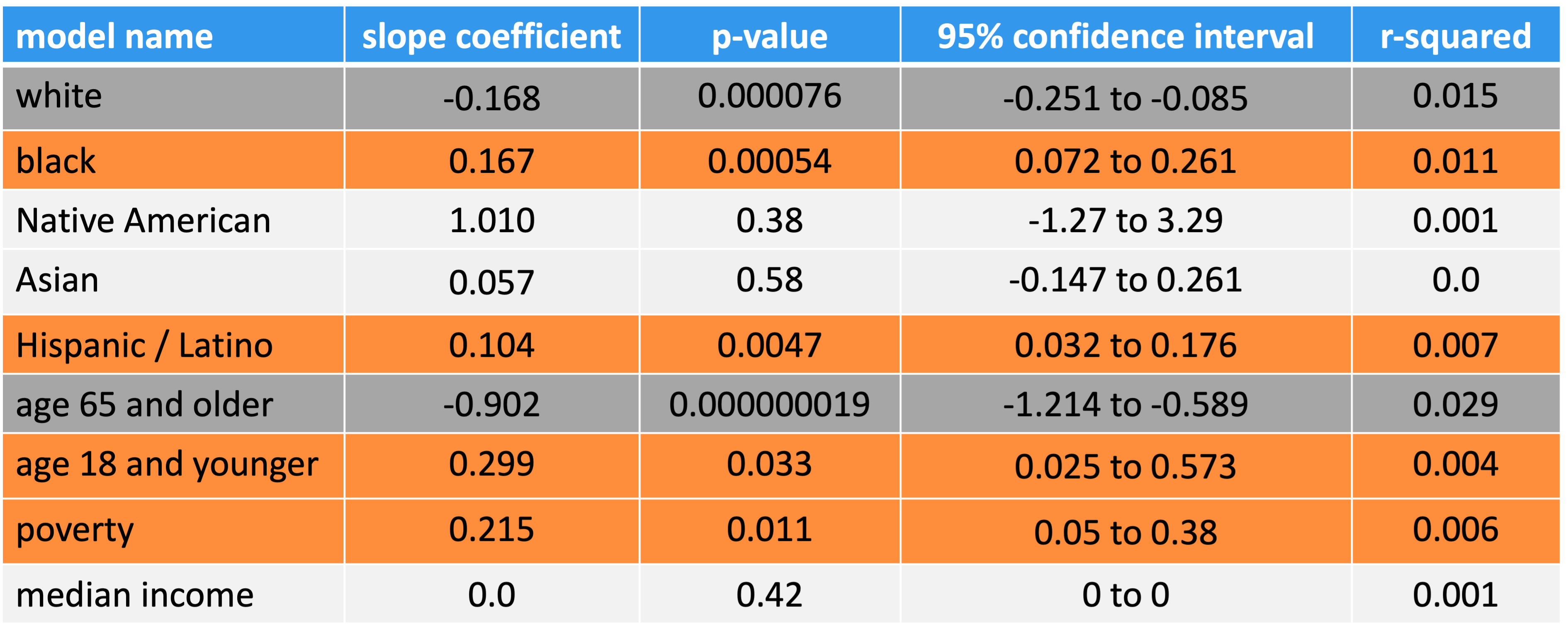
Linear regression models of percent of households without power vs. census variables
| Race | percent white percent black percent Native American percent Asian percent Hispanic / Latino |
| Age | 65 and older children under 18 |
| Income | percent households below poverty median income |
Statistical Analysis
# linear regression model
model_pct_white <- lm(data = blackout_census_data, pct_houses_that_lost_power ~ pct_white)

#plot
plot_model_pct_white <- ggplot(data = blackout_census_data, aes(x = pct_white, y = pct_houses_that_lost_power)) +
  geom_point(size = 0.5) +
  geom_smooth(method = lm, formula = y~x, se = FALSE) +
  theme_classic() +
  labs(x = "% white", y = "% of houses that lost power",
       title = "Linear regression of % households without power vs. % population white")
plot_model_pct_whiteStatistical Analysis
# linear regression model
model_pct_black <- lm(data = blackout_census_data, pct_houses_that_lost_power ~ pct_black)

# plot
plot_model_pct_black <- ggplot(data = blackout_census_data, aes(x = pct_black, y = pct_houses_that_lost_power)) +
  geom_point(size = 0.5) +
  geom_smooth(method = lm, formula = y~x, se = FALSE) +
  theme_classic() +
  labs(x = "% black", y = "% of houses that lost power",
       title = "Linear regression of % households without power vs. % population black")
plot_model_pct_blackResults
Conclusions
While race, age and income accounted for small portions of the overall variance in residential power outages, this analysis suggests some racial and economic inequality.
Electric utilities should evaluate infrastructure and asset management plans in areas with higher proportions of people of color and poverty
There is a need for more equitable responses to natural disasters
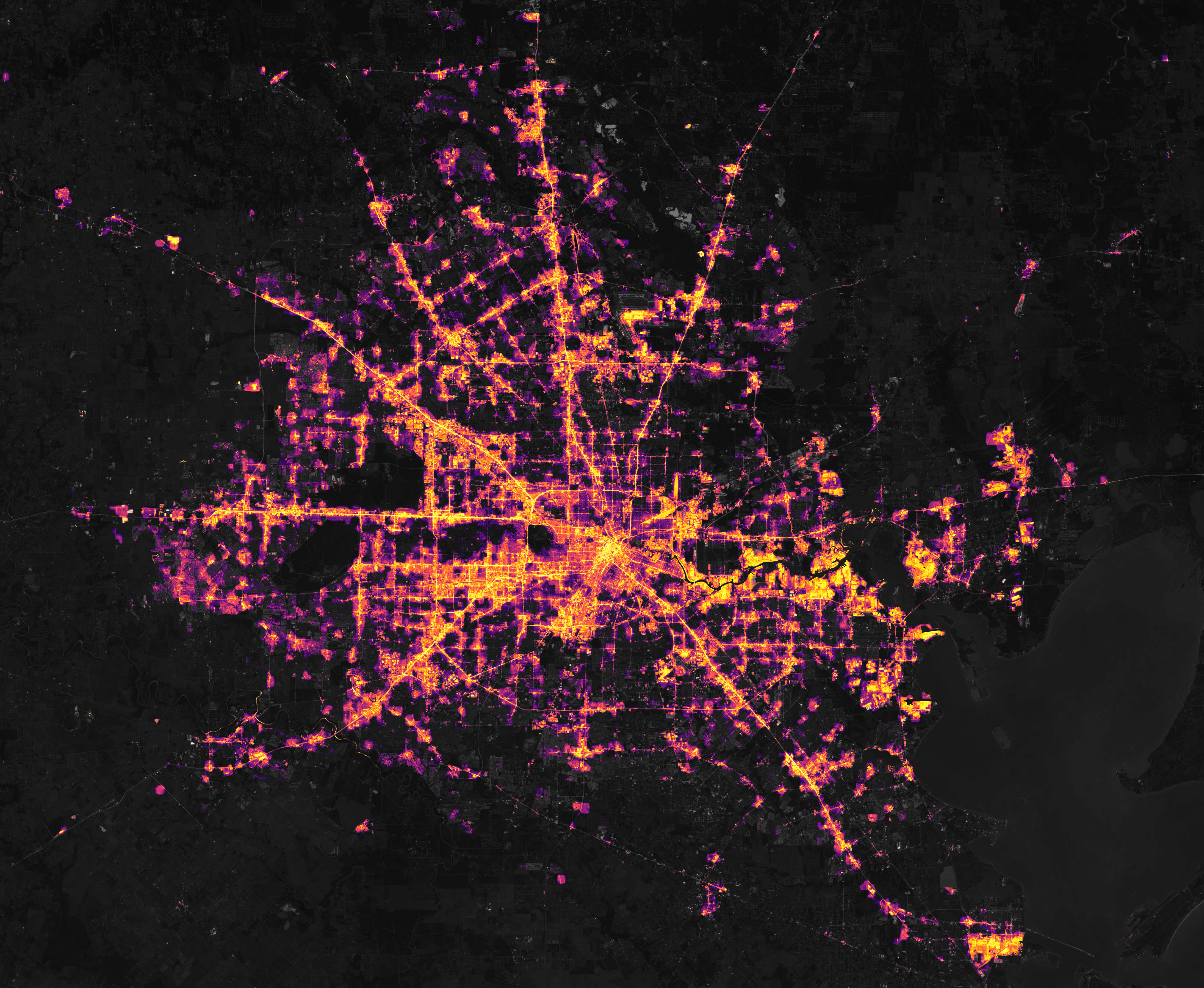 image source1