# url to csv file
data_url <- "https://knb.ecoinformatics.org/knb/d1/mn/v2/object/urn%3Auuid%3A7fc6f6db-c5ea-426a-a743-1f2edafb43b8"

# download the data and metadata to project folder
data_path <- metajam::download_d1_data(data_url, "~/Documents/metajam_example")

# Read the data and metadata
hh_list <- metajam::read_d1_files(data_path)

# get the household data frame
hh_data <- hh_list$data

# get the attribute (columns) metadata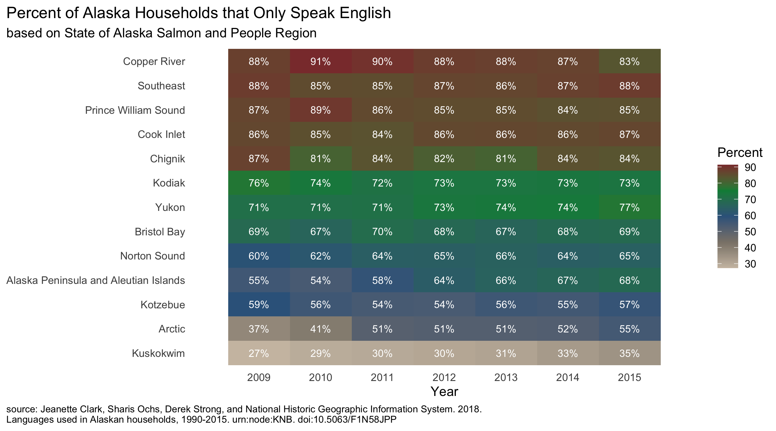
hh_att_metadata <- hh_list$attribute_metadataAn assignment for my Metadata Standards, Data Modeling and Data Semantics class included using the metajam R package to download Alaskan household languages data and metadata from knb. After reviewing the metadata and reading the data into R, we were tasked with writing code to compute the percentage of Alaskan households that only speak English for the years 2009-2015 and visualizing these results…a straightforward task.
But…as I reviewed the numbers I thought about what I actually wanted to capture in the visualization. Did I want to focus on changes over time? There was a slight trend, but nothing significant. The data included State of Alaska Salmon and People Regions (SASAP) so I wanted to show any regional differences.
Here’s the final visualization
The items below outline my data visualization process and helpful resources. Full code for data processing and visualization are included at the end.
1. Heatmap with geom_tile( )
A line graph showing change in time would not have been very interesting, but I didn’t want to exclude the time component by just creating a bar chart of each group. The heatmap tiles provided an efficent way to capture regional differences, subtle changes in time, and percentages of household that only speak English.
Resource: Allison Horst’s Advanced Data Visualization in ggplot2
2. Ordering the data
I used fct_reorder to sort the SASAP regions by average percent of households that only spoke English
mutate(SASAP.Region = fct_reorder(SASAP.Region, percent_only_english, .fun = mean))
3. Text within tiles
This line of code rounded the calculated values and displayed white text with a % symbol
geom_text(aes(label = paste0(round(avg_percent_english, 0),"%")), color = "white", size = 3)
4. Picking colors
This might have been the hardest part. I played around with the number and shade of colors and settled on shades of gray, blue, green and reddish brown with a scale_fill_gradientn gradient. geom_tile(aes(fill = avg_percent_english), show.legend = TRUE)
The NCEAS R color cheatsheet was helpful for getting color names. Useful information on gradient color scales was found in the book ggplot2: Elegant Graphics for Data Analysis and ggplot2 documentation
5. legend title
labs(fill = "Percent")
Resource: Editing legend (text) labels in ggplot
6. x-axis
While there are more elegant ways set axis divisions for dates, I opted for a simple vector of years. scale_x_discrete(name = "Year", limits = c(2009, 2010, 2011, 2012, 2013, 2014, 2015))
7. Remove gridlines
theme(panel.grid.major = element_blank())
8. Move title and caption from panel to plot area
theme(plot.caption = element_text(size = 8, hjust = 0), plot.caption.position = "plot") + theme(plot.title.position = "plot")
Resource: Changing position of plot captions
Download data using metajam
Tidy Data
Code used to process the data
I adjusted the original data processing code as my plan for the visualization evolved
household_language <- read_csv(here("data", "doi_10.5063_F1CJ8BPH__household_language__csv", "household_language.csv"))

hh_data_english <- household_language %>%
  filter(Year >= 2009) %>%
  filter(total > 0) %>%
  mutate(percent_only_english = (speak_only_english / total) * 100) %>%
  relocate(percent_only_english, .before = german) %>%
  mutate(SASAP.Region = fct_reorder(SASAP.Region, percent_only_english, .fun = mean)) %>%
  group_by(SASAP.Region, Year) %>%
  summarise(avg_percent_english = mean(percent_only_english))
ggplot
Code used to create the plot
only_english_plot <- ggplot(hh_data_english, aes(x = Year, y = SASAP.Region)) +
  geom_tile(aes(fill = avg_percent_english), show.legend = TRUE) +
  geom_text(aes(label = paste0(round(avg_percent_english, 0),"%")), color = "white", size = 3) +
  scale_fill_gradientn(colors = c("antiquewhite3", "antiquewhite4", "steelblue4", "springgreen4", "indianred4")) +
  theme_minimal() +
  theme(panel.grid.major = element_blank()) +
  labs(x = "Year", y = NULL,
       fill = "Percent",
       title = "Percent of Alaska Households that Only Speak English",
       subtitle = "based on State of Alaska Salmon and People Region",
       caption = "source: Jeanette Clark, Sharis Ochs, Derek Strong, and National Historic Geographic Information System. 2018.\nLanguages used in Alaskan households, 1990-2015. urn:node:KNB. doi:10.5063/F1N58JPP") +
  theme(plot.caption = element_text(size = 8, hjust = 0),
        plot.caption.position = "plot") +
  theme(plot.title.position = "plot") +
  scale_x_discrete(name = "Year", limits = c(2009, 2010, 2011, 2012, 2013, 2014, 2015))
Data citation: Jeanette Clark, Sharis Ochs, Derek Strong, and National Historic Geographic Information System. 2018. Languages used in Alaskan households, 1990-2015. urn:node:KNB. doi:10.5063/F1N58JPP.
https://knb.ecoinformatics.org/knb/d1/mn/v2/object/urn%3Auuid%3A7fc6f6db-c5ea-426a-a743-1f2edafb43b8”
Citation
BibTeX citation:
@online{rivers2021,
  author = {Rivers, Marie},
  title = {How {I} Made This Visualization},
  date = {2021-11-03},
  url = {https://marierivers.github.io/posts/2021-11-03-how-i-made-this-visualization/},
  langid = {en}
}
For attribution, please cite this work as:
Rivers, Marie. 2021. “How I Made This Visualization.”
November 3, 2021. https://marierivers.github.io/posts/2021-11-03-how-i-made-this-visualization/.